Yield curve (Yield curve wiki) is broadly perceived as a leading economic indicator.Specifically an inverted/flat curve has signaled many times since 1970 a market top and a subsequent recession


The above chart shows the difference between 10-year yield and 2-year yield.A zero or negative reading means a flat or inverted yield curve respectively.During 2000 top and near 2007 top of equities market the difference was zero to negative, signaling a market top.
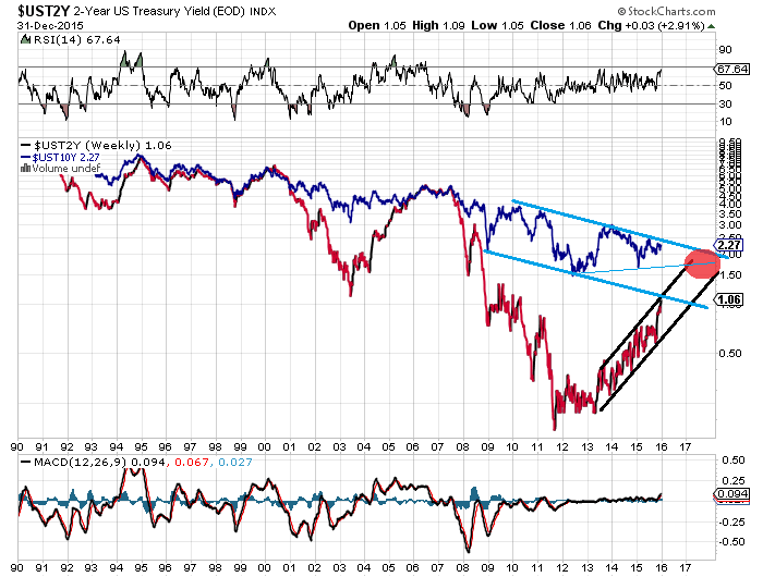
As we can see from the above chart, 2-year yield is in a steep rising channel, when 10-year yield is in a descending channel.A projection of these two channels shows a convergence of them (a.k.a a flattened yield curve, a.k.a an equities market top) in 2017.

Will 2016 be another painful year for bears or this time will be different?
ليست هناك تعليقات:
إرسال تعليق